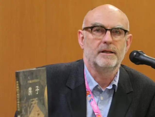
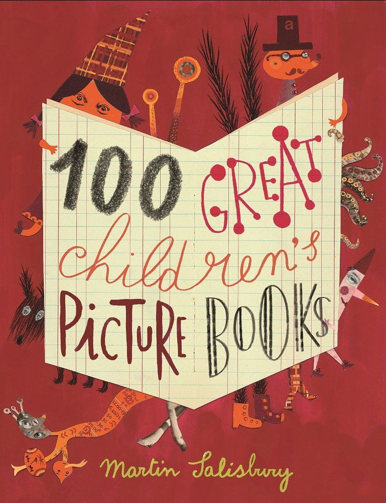
In recent years, there has been a significant increase in the production of children’s books worldwide, especially in Turkey. Children’s books have become not only a literary genre but also a serious industry. Many publishers have entered this sector, viewing it as a commercial opportunity. However, illustrated children’s books deserve to be among the most refined and delicate works of both language and visual arts. Martin Salisbury is one of the prominent figures recognized globally in the field of illustrated children’s books, both for his identity as an artist and his academic expertise. We had an enjoyable interview with him about illustrating children’s books.
Thank you for taking the time to speak with us. What initially drew you to the field of children’s book illustration?
Well, that’s a long story so please bear with me! I always loved drawing as a child. Drawing and nature actually, so I spent a lot of time drawing animals, birds and places. At junior school, I would make books and magazines about wildlife, writing and drawing and ‘designing’ I suppose, although I didn’t know what that word meant at that age. Later, at a rather academic senior school, the only subjects that I was really engaged with were Art and English. I suspect that I still hold the school record for the lowest ever grades in Maths and the sciences.
When it came close to time to leave school, we would each be sent to meet with the ‘careers advisor’. He would advise students to either try for university or go to teacher training college. I didn’t want to do either. I had recently discovered that there was a thing called ‘art school’ (in those days, these institutions were separate from universities). This sounded wonderful to me, so I said, “I think I’d like to go to art school”. The careers advisor was horrified and said something like “… but how would you get a job?”. When I walked into the art school, it felt like I had arrived in heaven, a place where everyone draws! After the Art Foundation Course, I progressed to another art college in the south of England for three years studying Illustration. I was taught by the wonderful illustrator, Gerald Rose, who had been the youngest winner of the Kate Greenaway Medal (now renamed Carnegie Medal). I then worked for many years as an illustrator, mostly for non-fiction children’s books. So my background is very much in ‘practice’ – the professional practice of illustrating books.
In the past, illustrations in books—whether printed or handwritten—were often created for adults. When and how did the first books illustrated specifically for children emerge?
I can’t claim to be a reliable historian, as my focus has always been on the practice of making illustration. But I understand that one of the earliest such books was Kunst und Lehrbüchlein, published in Frankfurt in 1580, with woodcut illustrations by Jost Amman. Johann Amos Comenius’s Orbis Sensualium Pictus of 1658 is usually cited as the most significant early book written and illustrated primarily with children in mind. It was first published in Nuremburg, in German and Latin, then in English the following year. Comenius was a cleric, philosopher and educator who had strong views about the importance of images. He declared that “for children, pictures are the most easily assimilated form of learning they can look upon”. There are many further examples of pictorial publications such as the cheap ‘chapbooks’, illustrated by crudely cut woodblocks, that were sold by travellers around country towns and villages through the 18th Century. But it was in the 19th Century that illustrated books for children really ‘took off’, after the invention of lithography by Alois Senefelder in 1786. The so-called ‘Golden Age’ of illustration in the late 19th and early 20th Century saw a period of lavishly illustrated and produced books. But the children’s books, certainly here in the UK (which was at that time at the forefront of many developments) were often highly sentimental and patronising, displaying an idealised notion of childhood innocence.
When we look at children’s books from different cultures, distinct differences in illustration style and storytelling become apparent. How do you think these differences reflect the identity of their respective cultures? Additionally, how can one maintain a “local” identity while addressing a “global” audience?
This is a really interesting and important question, one which I am constantly considering the answers to. One of my favourite quotes is from the South African novelist, Damon Galgut. He says, ‘The only way you can be truly universal is to be sure you are very specifically local.’ Many years ago, I wrote an article for the IBBY journal, Bookbird, titled No Red Buses Please. The title referred to instructions that had been given by an editor to one of our graduates, at a time when many publishers were trying to ensure that their picturebooks were not too culturally specific, in the (in my view misguided) belief that this would limit their potential to sell overseas co-editions. The issue especially pertinent in relation to the course that I designed and continue to teach on, the MA in Children’s Book Illustration here at Cambridge School of Art (at Anglia Ruskin University). On the course, we now have students from all around the world. As it is an advanced, post-graduate course, they bring with them in their work their various cultural and artistic influences. Such influences can come from a wide range of origins – the historical visual/ fine/ decorative arts culture of their home region, the climate, the colours, the landscape, the wildlife and flora etc. So, we would expect a student from Mexico to produce very different work from a student from, for instance, Eastern Europe. But (and it is a big ‘but’) when I was an art student, there was no internet, and my limited knowledge of the work of other artists and illustrators came from whatever I could find in books and journals. Today’s illustrators are bombarded daily with thousands of images on their phones and laptops, images from every culture around the world. Artists’ agents now represent illustrators from many different countries. In many ways this is a good thing. Since I founded the Masters course in 2001, I have seen a gradual change in publishers’ responses to the work of graduates from around the world, a loosening of attitudes around what is seen to be ‘appropriate’ visual work for children. We have also seen the work of brilliant artists such as Beatrice Alemagna finally become accepted in English language publishing, having previously been seen as ‘too artistic/ sophisticated’ for the English market. However, the question that I grapple with is, will this lead eventually to a homogenisation of illustrative visual language?
I do see this happening at the ‘lower’ end of publishing – art agencies that represent far too many artists, most of whose work is indistinguishable, often consisting of luridly coloured, formulaically stylised ingredients that are digitally assembled from aspects of other artists’ work rather than through a personal vision that evolves as a response to the world around them. This is why we place so much emphasis in our teaching on drawing. Drawing from observation is about much more than developing hand skills. It is about learning to see, and to process a subjective response to the world around us.
What does an illustrator need to pay attention to in order to properly illustrate a story? Apart from technical skills, what other factors do you think are equally important?
In order to address this question, we need first to clearly distinguish between illustrating a story and creating a picturebook. I have learned through the translations of my own books that there is much potential for confusion here, due to the various terminologies across languages. In English, the term picturebook (one word) refers to a book that delivers its meaning through a subtle interaction of word-language and picture-language, neither of which would make sense in isolation from the other. Most often nowadays, due to the sophisticated nature of this word-image relationship, these are created by a single ‘author’, increasingly described as a ‘picturebook-maker’. Illustrating a pre-existing word-based story, however, is a very different process. The illustrator needs to consider what they can add to the reader’s experience, being careful to complement the text but not to intrude on the reader’s imagination by being over literal. The best illustration in this context, rather than duplicating visually what the words are saying, will find something slightly different to ‘say’ by focusing perhaps on atmosphere and sense of place. A literal visual representation of moments of drama is usually reductive. The prolific and much-admired Twentieth Century English illustrator, Edward Ardizzone very rarely drew close-ups of characters’ faces. But we tended not to notice this fact because he was so brilliant at describing characters through their gestures, interactions and all-round body language.
In the past, many artists pursued their own artistic practices while also illustrating children’s books. Today, however, we see many illustrators focusing solely on this field. What turning points or significant trends can we identify in the history of children’s book illustration?
This, again, is a very interesting question! I tend to look at this through the lens of the educator. It is an issue that is closely tied to the history of art education, a subject that is close to my heart. Without going into great detail about this history, it is fair to say that, through most of the history of art schools here in the UK, there was a clear hierarchy which placed Fine Art at the top of the tree. And for much of this history, ‘Fine Art’ meant painting. Teaching was therefore primarily based around the development of observational drawing and painting skills, working in the studio from the model and the classical antique cast. These skills could easily be repurposed to the activity of illustration, often as a supplement to the primary focus painting, in order to provide income. Today, there is very little drawing teaching in Fine Art courses here, as the field has moved further and further away from painting, into the purely conceptual. For much of the late Twentieth Century, Illustration, or ‘commercial art’ was seen to be of lower purpose academically, and to some degree this is still the case. But it is the emergence of the authorial picturebook-maker that has really been a ‘game-changer’ and challenged traditional perceptions of the practice of illustration as subordinate to the written word. Artists such as Jon Klassen, Beatrice Alemagna, Shaun Tan and many more can be seen as expressive ‘artists’ in the true sense, who happen to have chosen illustration as the most appropriate field for their art.
When I first began to do some part-time teaching at art school alongside my own work as an illustrator, I was surprised to discover that children’s book illustration was regarded as the lowest of the low. The teaching focussed mainly on magazine/ editorial illustration and design. It was because of these attitudes that I decided to design a postgraduate masters course in Children’s Book Illustration. I expected there to be perhaps ten or twelve students each year. I didn’t know at the time that this was the first university masters course in the subject in the world. We now have over three hundred applicants every year.
Children’s literature has become a large industry today, leading to what we might call an “inflation of writers and illustrators.” How can we recognize a truly good children’s book? In such a crowded field, what is the greatest danger facing children’s books?
Most people would agree that there are now far too many children’s books, especially picturebooks, published every year. Most do not sell enough to sell out their first edition. A ‘truly good children’s book’ is of course a partly subjective concept. I don’t feel qualified to pronounce of children’s literature in general. I have commented above on what I believe to be some of the important ingredients of good illustration in a text-led book, but even here there can be intangible elements that defy deconstruction. Regarding picturebooks, if I knew what made a commercially successful picturebook, I would be a rich publisher! It is important to remember though, that publishers often don’t know either. Of the many of my graduates who have created internationally successful picturebooks, a significant proportion of these were initially rejected by several publishers. As far as the concept of ‘good’ goes in picturebooks, I will return to your third question above, and would suggest that, when evaluating the quality of a picturebook we should ask ourselves, “Does this book feel sincere in its execution?”, “Is the artist’s ‘voice’ authentic?”, or is it trying too hard to conform to a particular stylistic trend or notion of what a picturebook should be?”.
When asking such questions, I always find myself returning to one of my favourite, and in my view one of the most wonderful picturebook pioneers, John Burningham. He was not a natural draughtsman; his drawing was not ‘academically’ strong. Yet there is magic in every page. His books seem to come straight from the heart. You can’t really teach that.
There are many works that can be considered masterpieces, both in terms of literary content and illustration. Which books would you particularly recommend for their content and visual quality—ones that you believe should be studied closely?
In endeavouring to answer this question I feel I need first to give some context to my views. I would also say that I don’t think ‘content’ and ‘visual quality’ are separable.
I realised early on in my ‘academic’ career, to my great surprise, that the body of theoretical study around picturebooks was entirely in the hands of children’s literature academics, who were studying and analysing these artefacts from the perspective of word-based literature. This seemed very odd to me, bearing in mind that the picturebook is a primarily visual medium and artefact. I became aware that many of the books that were considered ‘classics’ by those in this field were not books that I considered to be of a high standard in art and design. Much of the theory seemed to me to be trying to ‘decode’ pictures into words, using social and political contexts rather than visual ones in order to try to ‘understand’. So I am wary of speaking about ‘studying closely’ in an academic sense. Despite being a professor, I think perhaps I am somewhat anti-academic (I don’t believe that art schools belong in universities). So, part of me says ‘follow your heart’. I believe that the ‘way in’ to a picturebook is through the visual. And like paintings in a gallery, different people will be touched by different art. Like art, picturebooks can be playful, ironic, poetic/ lyrical, sad etc., etc.
In many ways, the picturebook also comes close to film or music as a medium, requiring as it does an understanding of pace, rhythm and composition. One of the finest picturebook-makers, and one who seems to speak equally strongly to artists, Children’s literature academics and, more importantly, children, was John Burningham. My own favourites of his are less well-known ones but which have a particularly strong sense of place and time, such as Humbert (1965), for the way that the backdrop of the city of London is so beautifully portrayed and Seasons (1969), for the richness of his evocation of the changing times of the year. Looking at the exciting work going on currently in the field, Jon Klassen is pushing at the boundaries of minimalism and irony, Beatrice Alemagna’s fearlessly sensual visual poetry is irresistible and Isabelle Arsenault’s elegant draughtsmanship and delicate pattern-making delights the eye. I believe that we are in something of a new Golden Age.